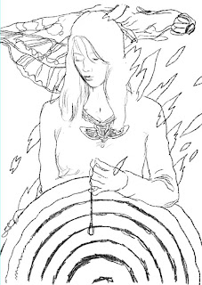
 Without giving away too much about the specifics of the project, I can tell you that it's a movie poster for what looks to be a very well shot and exciting re-telling of a modern Dante's Inferno.
Above is the first sketch. The guidelines were essentially that the piece be more emotional than literal. The client wanted to get rid of any unessential elements and focus more on the form of the paint in order to communicate a distinct mood.
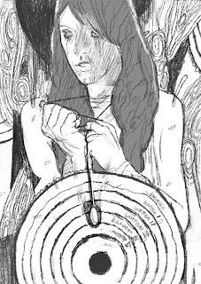 the approved sketch!
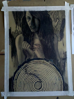 here I'm using charcoal on tan BFK after I've taped the paper securely with artists tape.
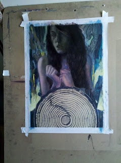 sorry for skipping a bunch of time to this next photo. After the charcoal layer was finished, I sprayed it with workable fixative then coated it with about 3-4 coats of thinned matte medium. this makes it possible to paint on the surface of the paper without damaging it or having the pigment soaking through the paper. I glazed many areas since I established some strong values already with the charcoal. other areas I apply the paint more heavily in an impasto manner. Color wise I'm think about basic cool/warm relationships rather than trying to get the perfect color.
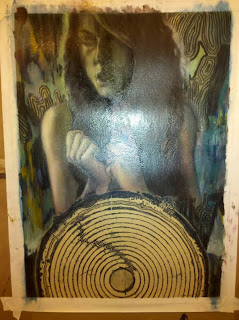 after the first layer, i let the painting dry and then glaze the entire image with a little bit of pthalo blue and another layer with a little bit of yellow ochre and yet another layer with a bit of cadmium red. this gives the surface depth.
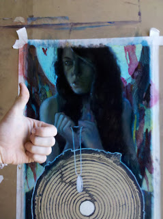 After the glazing I go back and continue working on the face - it was important to the client that the likeness be there. Unfortunately, I don't have any shots before the final with the face completed. let's just say i spent another 8 or so hours just on the face - tweaking eyebrows, pupils and the like.
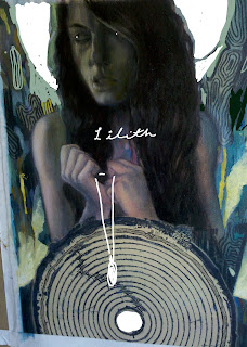 at one point i took a crappy cell phone picture and uploaded it into photoshop to figure out some compositional things and a quick idea for type. much easier than doing this with oil paint...
 So with the face complete, all I need is Grimbo's approval and we're good to go to the digital phase. Alright! I think that's a thumbs up...
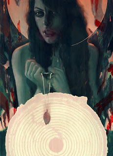 Voila! Finished. click for a hi-res version. All I did in photo shop was ghost the concentric circles and do a little pixel sweeping. I also did some color editing and added a few red multiply layers but nothing too major. Generally I find that trying to solve problems digitally results in muddiness so I usually try to keep the digital aspect minimal unless I plan specifically for it in the sketch phase.

7 comments:
That is amazing Cam. Seriously awesome.
Thank you very much, Sarah
She's a beaut, Cam!
holy crap this is friggiinn awesome!!
there is a small element in this work that reminds me of my fav. artist sam weber.
keep up the good work!
Man this looks really awesome!
yes! figures rendered to the fullest
So sweet!
Post a Comment