O herro.
Waking up to the phone ringing at 8:30am is usually not a pleasant experience. However, if it's SooJin Buzelli from PLANSPONSOR magazine on the other line offering you a job, the lingering magnetism of sleep is quickly dissipated. Working on this project was a good learning experience among other things and I think it helped me to gain more perspective on the strengths/paths/discontents/possibilities of how an illustration can communicate to it's audience.
Below I've gleaned some pieces from my process in case anyone is interested in how this piece came to be.
SooJin has somewhat of a reputation (a good one) for being a great art director in terms of the freedom she gives to illustrators. I was doing some pretty boring sketches at first. It took me a while to really push what I was doing past the more obvious solutions. Here's the sketch that we agreed upon.

Here I'm trying to figure out the placement of the astronauts.

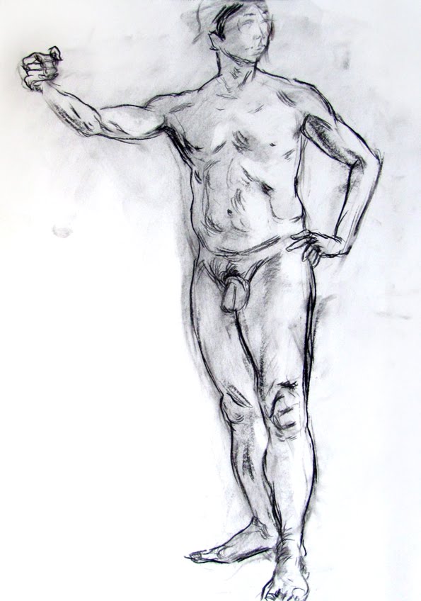
Here is a piece of the final drawing. I transferred my sketch to a piece of Rives BFK (which I'm getting sick of using) by blowing up my sketch and putting compressed charcoal on the back of the paper. I then traced certain parts of the sketch. I don't do this so much to save time or for the ease of tracing but because the resulting lines have a nice texture to them, weathered and strained. I think it's important to really consider the application of mediums throughout the entire process. A single texture in one place is ok by itself but when it comes together with the other parts of the piece the varying textures can really add depth and interest to the piece. Plus, people won't be able to tell how you did what you did!

Before I went onto this step in which I added some acrylic and gel pen, I scanned the drawing in the previous stage. I do this so I can use the line work at a later time in the digital world if need be.

Add some digital coloring, a dash of Hokusai influence gradients in the background and, of course, some arbitrary floaties on the surface of the image and it's a wrap.

PSYCH.
This piece got rejected. The powers at be felt it wasn't my strongest piece and I must say, I agree. Sometimes things just don't click and this happened to be one of those times. I actually relished the opportunity to give it another shot. Art school has given me enough of a tough skin to not really take any criticism personally (about my art that is).
This time around I likened "Bells and Whistles" to having an excessive and complicated synth collection, something I dream about regularly.

Here I'm trying to figure out how I want to have this figure interacting with the space. I envisioned some flat bodied lunatic raving over his collection. I chose to go simple with him in order to keep the piece from being too busy since the background is almost filled entirely with tiny synthesizer bits.

Here's an alternate color version. I think I like this one better.....nothing to be done about that now I suppose.

This one made the cut. You can view it in the September issue of PLANSPONSOR magazine (if you can find one). Or at their website! Thanks to SooJin for pushing me on this.

Hope you guys found this helpful/interesting. Until next time!


 Coincidentally, I stumbled upon Moreau while reading "2666" by Roberto Bolaño. The design of this cover is just amazing. The intricacy and lushness of his images will keep you looking at them time and time again, always finding something new.
 This image looks so modern! The design of the fish-monsters looks straight out of "The Punisher". I especially love the colors and luminosity. Even without knowing the context of the image there is a strong mood and implied narrative - qualities that are necessary to any good illustration.