Tuesday, March 1, 2011

Process post: Movie Poster

Without giving away too much about the specifics of the project, I can tell you that it's a movie poster for what looks to be a very well shot and exciting re-telling of a modern Dante's Inferno.

Above is the first sketch. The guidelines were essentially that the piece be more emotional than literal. The client wanted to get rid of any unessential elements and focus more on the form of the paint in order to communicate a distinct mood.
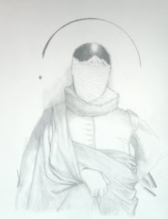
the approved sketch!
here I'm using charcoal on tan BFK after I've taped the paper securely with artists tape.
sorry for skipping a bunch of time to this next photo. After the charcoal layer was finished, I sprayed it with workable fixative then coated it with about 3-4 coats of thinned matte medium. this makes it possible to paint on the surface of the paper without damaging it or having the pigment soaking through the paper. I glazed many areas since I established some strong values already with the charcoal. other areas I apply the paint more heavily in an impasto manner. Color wise I'm think about basic cool/warm relationships rather than trying to get the perfect color.
after the first layer, i let the painting dry and then glaze the entire image with a little bit of pthalo blue and another layer with a little bit of yellow ochre and yet another layer with a bit of cadmium red. this gives the surface depth.
After the glazing I go back and continue working on the face - it was important to the client that the likeness be there. Unfortunately, I don't have any shots before the final with the face completed. let's just say i spent another 8 or so hours just on the face - tweaking eyebrows, pupils and the like.
at one point i took a crappy cell phone picture and uploaded it into photoshop to figure out some compositional things and a quick idea for type. much easier than doing this with oil paint...So with the face complete, all I need is Grimbo's approval and we're good to go to the digital phase. Alright! I think that's a thumbs up...

Voila! Finished. click for a hi-res version. All I did in photo shop was ghost the concentric circles and do a little pixel sweeping. I also did some color editing and added a few red multiply layers but nothing too major. Generally I find that trying to solve problems digitally results in muddiness so I usually try to keep the digital aspect minimal unless I plan specifically for it in the sketch phase.

Game Over

These are for the "Game Over" show at the SF location of Giant Robot. My pieces were clearly inspired by my favorite video game franchise of all time: Mario! I felt the need to pay homage to such a big and important part of my life so I kept the basic form of the screen shot and used that as a starting point. They are both acrylic on panel.


Tuesday, February 22, 2011

overhanging branch girl


here's a quick sketch of a random person. i felt the need to paint it in a (relatively) natural manner. now's it's on the internet. time to play grand theft auto!

Wednesday, February 2, 2011

Tuesday, February 1, 2011

Giant Robot Year of the Rabbit

Hey Internet People -

This is my entry for Giant Robot's next upcoming show entitled "Year of the Rabbit". The show will focus on the 2011 animal ambassador from the Chinese zodiac calendar so expect to see a lot of furry little guys - and maybe some not so furry ones.

Sunday, January 30, 2011

SpaceFace sketch

think I will be turning this into finished piece when I get some time.

Thursday, January 20, 2011

Paintin' fer sellin'

Hey.

So since my show at the newly-opened Scoops Westside was in fact, not, a sellout. I'm happy to announce that I'm putting up these 6 little beauts for sale! They come from my show entitled "My Darling, Andromeda" and all center around the idea of romanticism within knowledge and how we create meaning, to be brief. They are small, around 6in or 7in each. I'm selling them for $150 (a steal!!!) Please buy one! (not you Mom :D)


Nylon Guys

So I was lucky enough to work with Alex Chow over at Nylon Guys magazine recently for a piece about...video games! I've been getting lucky with subject matter on most of my jobs and I hope it keeps up. Anyways, I'm going to be going through my basic process for this project.

The central focus of the article was about classic video games possibly being remade for current movement-based platforms like the Wii and the PS Move. My first idea focused on the idea of a video game factory that manufactured physical components of games - I chose Tetris specifically.

Alex didn't feel like there was enough emphasis on the actual movement associated with these new games and that my sketch seemed to be more about just re-making games so I tried out another idea.


This idea focused on a conductor deftly controlling a torrent of past video game characters/noticeable objects. Alex liked this one so I refined the idea.


From this point I dropped the sketch into PS and traced over it with some digital line work. Usually I prefer to have some trace of traditional media involved but the turnaround time was very short so I just stuck with the quicker approach. My process for this part is fairly straight forward digital coloring - a mixture of different layer properties for color effects, some textures, and some gradient action to push/pull emphasis. I can be more in depth about this part in the future if there is any interest.


Here's the final with a detail shot. Overall, I'm happy with how the piece turned out and it's always exciting to see your work in print. Thanks for reading!


Sunday, December 12, 2010

Post-It Notes!

Heya.

Here are my contributions to the 6th annual Post-It note show put on by Giant Robot. If your in the LA area stop by GR2 and check them out in all their post-it glory.


Tuesday, October 12, 2010

Bells and Whistles

O herro.

Waking up to the phone ringing at 8:30am is usually not a pleasant experience. However, if it's SooJin Buzelli from PLANSPONSOR magazine on the other line offering you a job, the lingering magnetism of sleep is quickly dissipated. Working on this project was a good learning experience among other things and I think it helped me to gain more perspective on the strengths/paths/discontents/possibilities of how an illustration can communicate to it's audience.

Below I've gleaned some pieces from my process in case anyone is interested in how this piece came to be.

SooJin has somewhat of a reputation (a good one) for being a great art director in terms of the freedom she gives to illustrators. I was doing some pretty boring sketches at first. It took me a while to really push what I was doing past the more obvious solutions. Here's the sketch that we agreed upon.

Here I'm trying to figure out the placement of the astronauts.

Here is a piece of the final drawing. I transferred my sketch to a piece of Rives BFK (which I'm getting sick of using) by blowing up my sketch and putting compressed charcoal on the back of the paper. I then traced certain parts of the sketch. I don't do this so much to save time or for the ease of tracing but because the resulting lines have a nice texture to them, weathered and strained. I think it's important to really consider the application of mediums throughout the entire process. A single texture in one place is ok by itself but when it comes together with the other parts of the piece the varying textures can really add depth and interest to the piece. Plus, people won't be able to tell how you did what you did!

Before I went onto this step in which I added some acrylic and gel pen, I scanned the drawing in the previous stage. I do this so I can use the line work at a later time in the digital world if need be.

Add some digital coloring, a dash of Hokusai influence gradients in the background and, of course, some arbitrary floaties on the surface of the image and it's a wrap.


PSYCH.

This piece got rejected. The powers at be felt it wasn't my strongest piece and I must say, I agree. Sometimes things just don't click and this happened to be one of those times. I actually relished the opportunity to give it another shot. Art school has given me enough of a tough skin to not really take any criticism personally (about my art that is).

This time around I likened "Bells and Whistles" to having an excessive and complicated synth collection, something I dream about regularly.

Here I'm trying to figure out how I want to have this figure interacting with the space. I envisioned some flat bodied lunatic raving over his collection. I chose to go simple with him in order to keep the piece from being too busy since the background is almost filled entirely with tiny synthesizer bits.

Here's an alternate color version. I think I like this one better.....nothing to be done about that now I suppose.

This one made the cut. You can view it in the September issue of PLANSPONSOR magazine (if you can find one). Or at their website! Thanks to SooJin for pushing me on this.


Hope you guys found this helpful/interesting. Until next time!

Saturday, October 9, 2010

New Bike!


I love craigslist. I'm an inch away from abandoning all other forms of transaction in favor of the low-res, half-assed car salesman style of advertisement of this beautiful site. Not really, but really - I got a great deal on this bike. It's a Raleigh Rush Hour with a Brooks B17 seat and some Specialized mountain grips. The crank is upgraded too. Just took it out today for a nice spin and it rides really nicely. Minus spending close to 30 min trying to get the thing to fit in my car on the way home when I bought it, I'm a very satisfied customer.

Tuesday, September 21, 2010

Fashion's Night Out LA final


Finished this. Things are falling into place...maybe. Many mediums went into this one and I finally feel like they aren't fighting each other. I'll be doing more pieces in this manner to hopefully get some idea of a consistent process.

You can see detail shots here

Check back soon for updates! Comments and feedback greatly appreciated :D

Sunday, September 19, 2010

Fashion's Night Out sketch


here's the final sketch for a piece I'm doing about the LA "Fashion's Night Out". Done entirely in photoshop

Thursday, September 16, 2010

New painting for sale

Hey all. I did the painting in a mad rush after Gary told me about a show he was in that had a one day deadline about the apocalypse. It turns out I won't be able to participate in the show due to time constraints but I managed to finish the painting anyways. In an effort to save time, I created the initial layer as a photo collage in PS. I've done this type of digital work before for band posters in the past. I like the strong contrast between the two languages so I'll definitely be doing more of these soon.

Also, this painting is for sale.


"Famine", Oil on Letra paper w/ toner transfer, 4"x 6"

It's going for $200.00 and comes floated in a nice and simple black frame with glass. Leave me a message or shoot me an email at camfloyd@gmail.com if you're interested.

till next time!

Tuesday, September 14, 2010